The Ask

National CineMedia wanted to add and extend their digital capabilities to their existing business.

The Solution

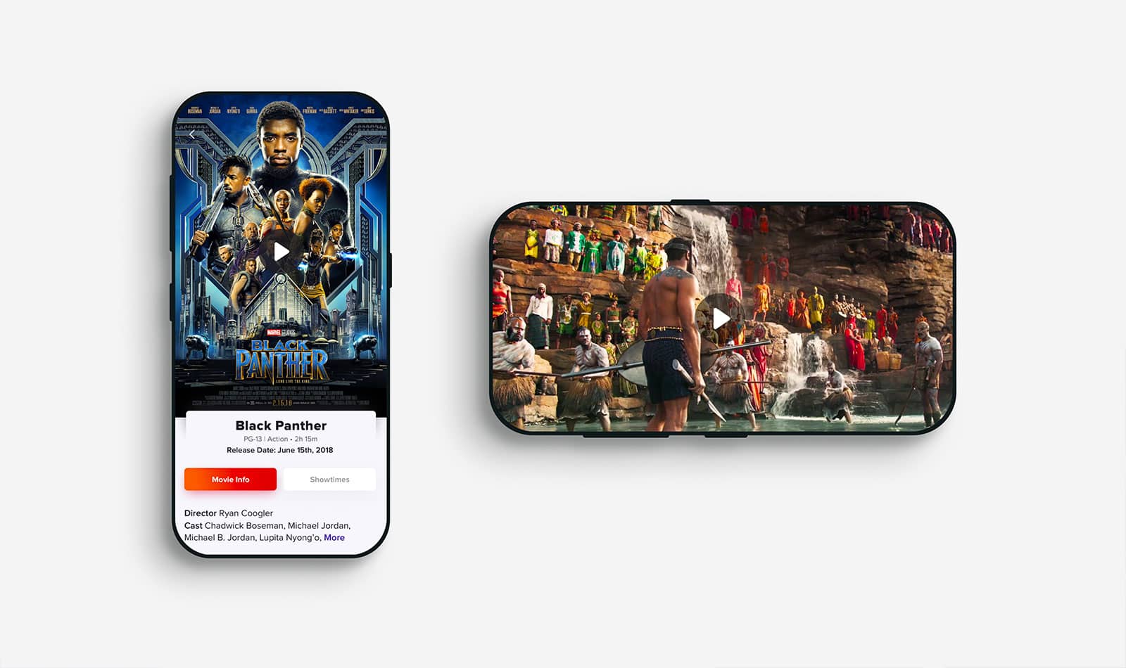
A mobile site called “Noovie” which highlights NCM’s expertise in entertainment by presenting users with an innovative UI and workflow for finding and sharing movie showtimes.

My Role

During 9 weeks, I teamed up with a team of 1 project strategist, 2 devs, and 1 UX strategist. Here are some of the big tasks I completed:

  • Branding
  • Competitive analysis
  • Information Architecture
  • Information Design
  • Prototyping
  • Usability testing
  • Front-End Mobile to Desktop

Execution: Let’s define what’s Noovie

My first challenge was to develop a digital brand identity for Noovie. I started a competitive analysis by printing existing competitors websites from floor to ceiling and looked for the sweet spot for Noovie. It was pretty obvious where Noovie would stick out in contrast to the existing competitors, the brand direction was transitioning from the dark, crowded and overwhelming information in the display and go towards to a youthful, bright, delightful and exciting position.

Competitor
Team defining the good and the ugly
Competitor
first visuals with the new direction

Getting the flow right

Some early wireframes displaying different solutions about my next challenge. The top priority was to offer to Moviegoers a quick and easy way to get access to movie content and showtimes in their area from their smartphone.

  • First iteration, I presented showtimes per movie but it was too granular causing a back and forth experience.
  • Second iteration, I removed one extra step by presenting showtimes per area with a movie comparison feature but by having this selection feature, I added complexity.
  • The final iteration presented all the showtimes for each movie by area, allowing moviegoers to find and compare showtimes at first sight, without opening an extra page.
Wireframes peek

Keeping the app fast and responsive

The noovie app is designed to pull a LOT of data into the moviegoers phone, which could result in a slower mobile load time. To maintain the Noovie art direction and successful front-end implementation, I had to keep minimal design assets. Some of the solutions I brought were:

  • Creating visual vectors like SVGs for icons and illustration instead of heavy jpegs, pngs…
  • Using light and standard typefaces like Arial or Roboto.
  • Designing in the code with fancy HTML5/CSS3 for gradients, shadows, animations, transitions…
  • Adding some Javascript for Lazyloading images.

End results – The loading time was considerably shorter, Designing up for Desktop was seamless since assets were vectorized or coded.

Showtimes screen in action
Trailer screen in action
Movie Detail Screen
Desktop Screen
Tablet Screen

Takeaways

This project was instructive for me designing for touch screens vs non touch screen. It’s easier to start designing with the mobile screens first, because they collectively are the most constrained. Mobile devices have the smallest screen real estate and limited interaction mode. You either have to find a fallback or create a solution for both platforms.